
Pinterest is unique from other popular platforms because it’s a place where people go to dream, plan, be inspired and discover new things to do or try. That means Pinterest has incredible amounts of data that provide insights into what is increasing in popularity, what interests are hot and what products support those interests. Businesses can now learn from these insights and respond to them within their own niche by tailoring their Pinterest marketing strategies to meet the actual user preferences with their content and products.
The best way to understand the power of the Pinterest Trends tool is to try it. Here’s a step-by-step example on how to use it…

On the top left side of your Pinterest account, click the dropdown arrow next to “Analytics.”
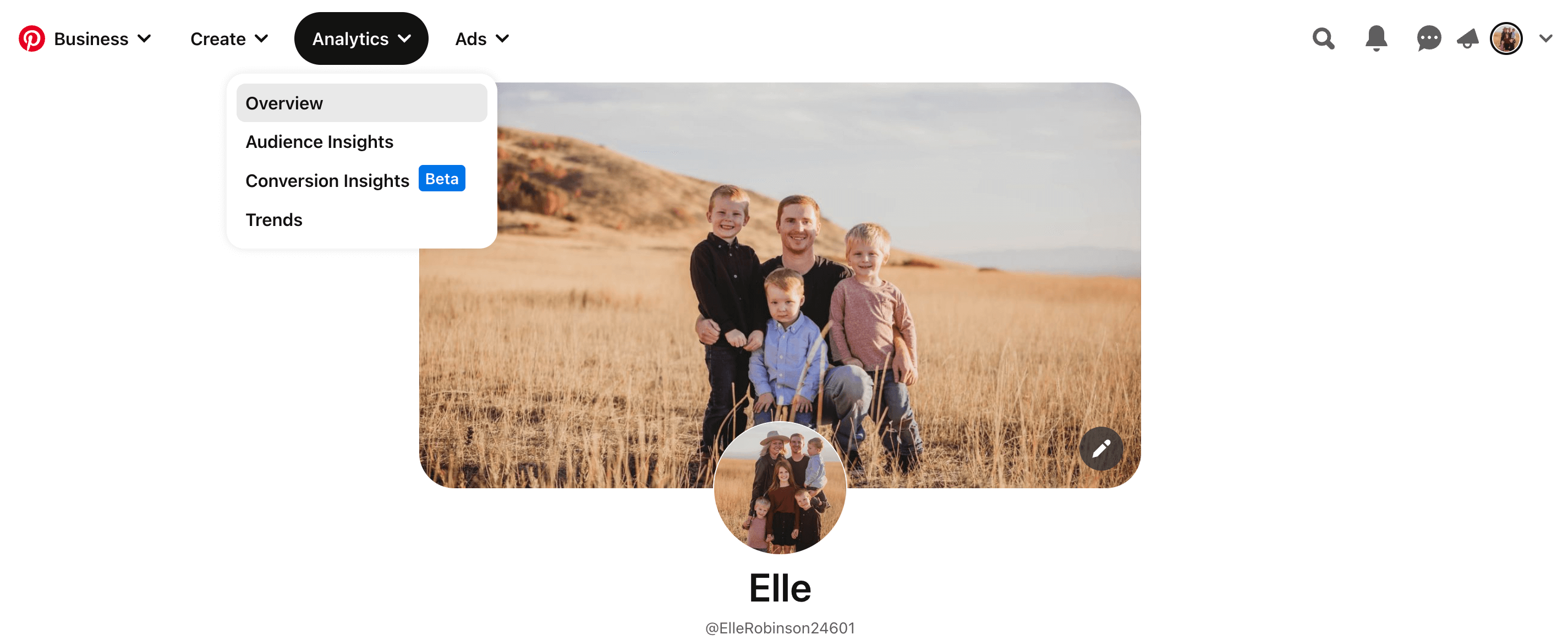
Choose Trends and you’ll be taken to the Tool.
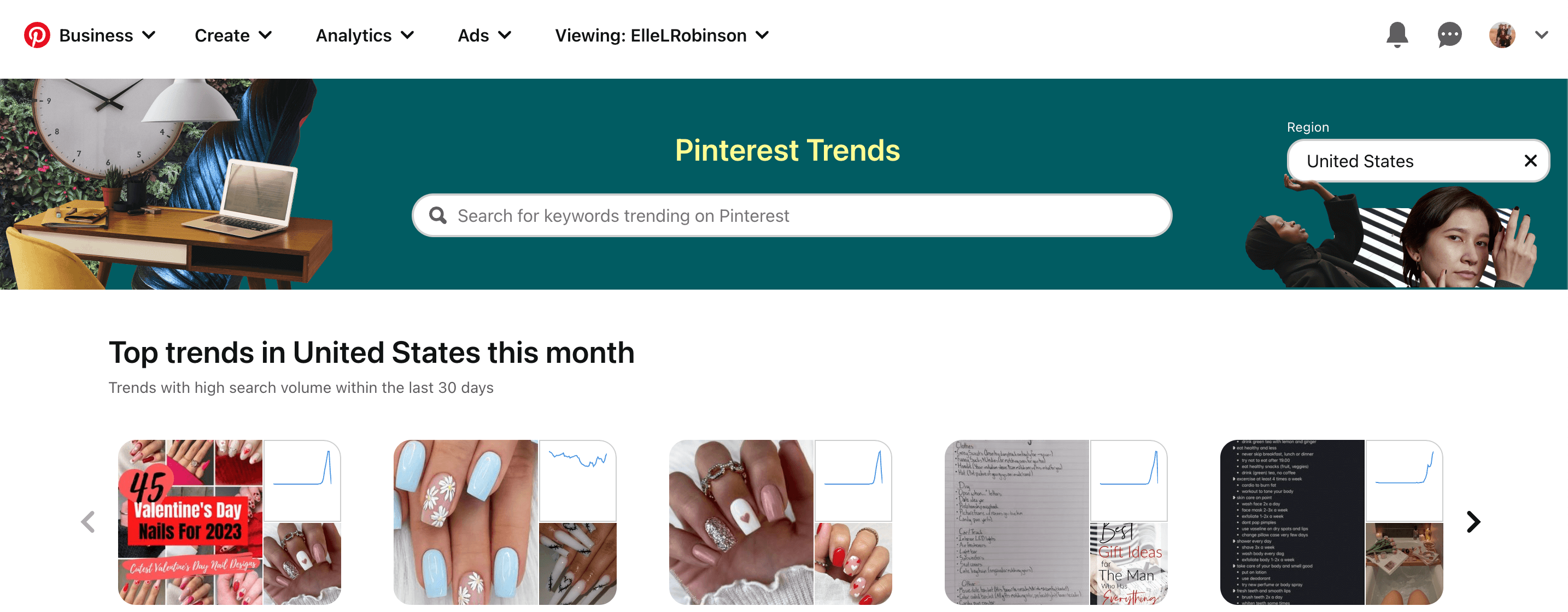
Then continue on the “Enter a search term – “
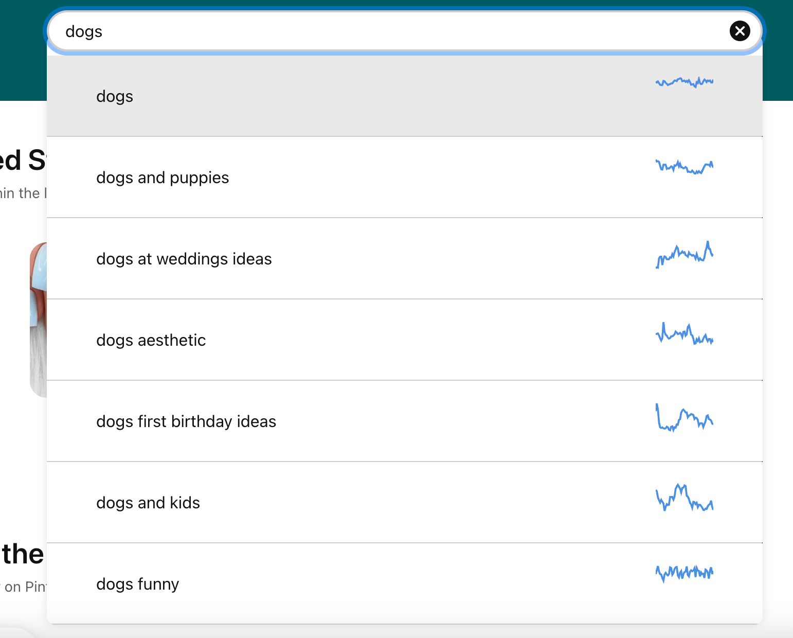
Enter a search term – in this case, I entered “dogs” If you enter a different term as you follow along and nothing comes up, try another related term. Pinterest continually adds new terms to the tool so if you are not happy with the results you are getting, try again in a week or two.
As you enter a keyword, notice the autocomplete suggestions that appear. These are much like the autocomplete suggestions we see when using Google. These suggestions are from real searches of trending terms that happen on Pinterest, which are relevant to the keywords you entered.
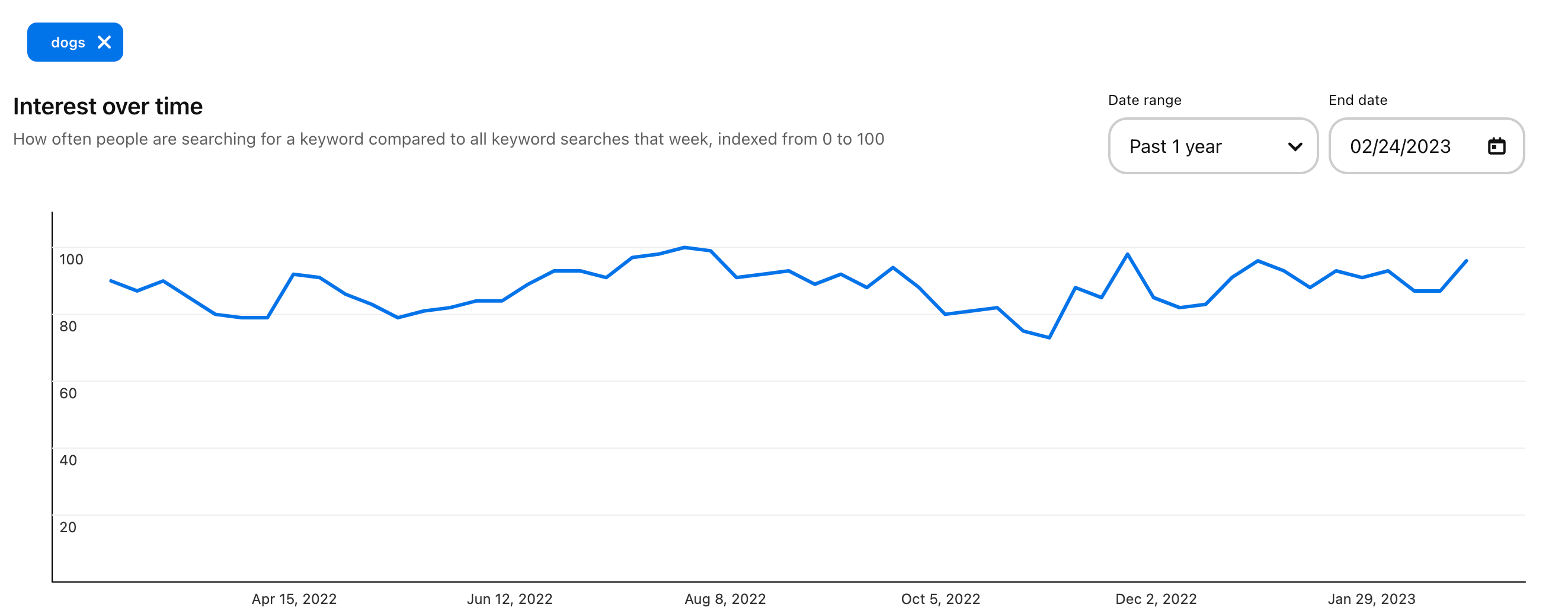
After entering a term, you’re presented with a graph:
Beneath the graph (which we’ll come back to in a sec) you’ll see “Related terms.”

Click on up to 3 of these related terms and Pinterest graphs them for you so you can compare 2, 3 or 4 related terms to your original keyword (term). Much like on Pinterest’s guided search, the related terms shown here go from left to right – most searched presented first on the left, to less frequently searched as you move right.
“Searches over time” shows data points that compare the search volumes of the term you entered to all other searches during that week.
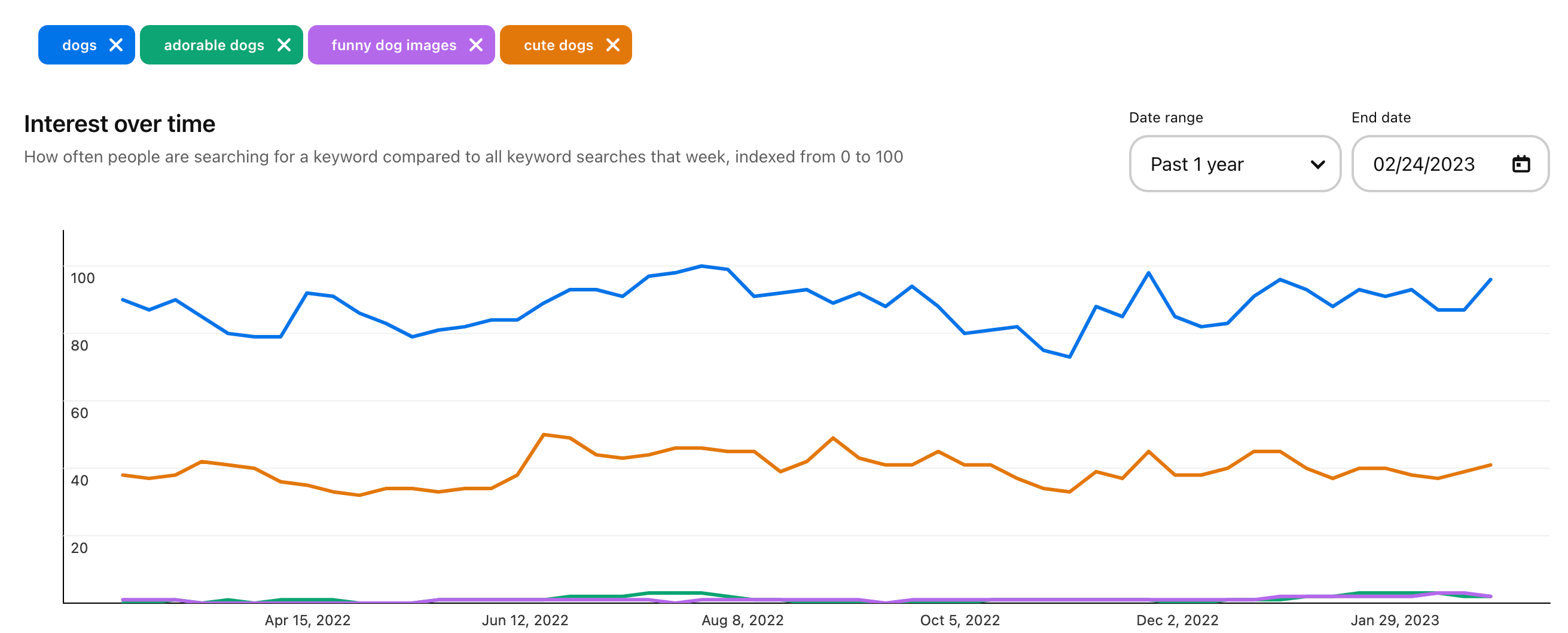
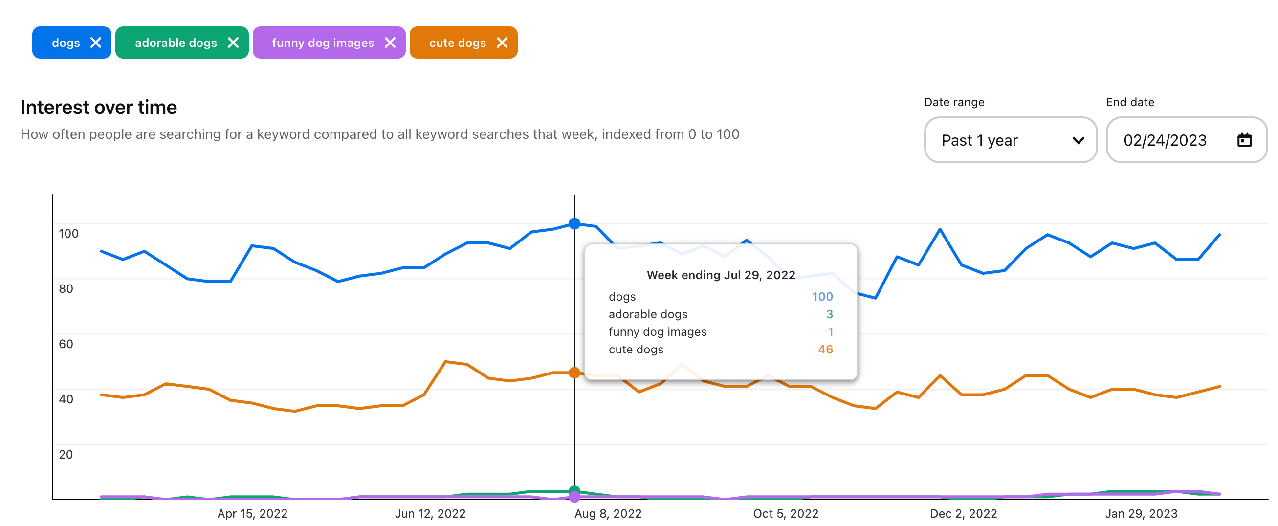
The results are then tabulated from 0 to 100 to compare the relative volume of each term. Huh wha…? No worries, all this means is that it’s based on the popularity of that search term week over week with 100 representing the most popular search term during that time. In other words, the vertical line represents a sort of scale of popularity and the bottom of the graph shows date ranges.
Hover over any line on the graph to see actual number comparisons. In my example “dogs” was searched for much more often than “adorable dogs” every single month. This could indicate that people were searching for dogs – rather than adorable dogs.
And finally check out Popular Pins for the term you entered.

In my example, pins showing various kinds of terms related to dogs come up. What can we learn from these? Click through and study them. Think about their text overlays, descriptions, use of colors and fonts. What do you like about them? Is there anything your pins about this term could be improved based on what you learn?

